Monday, February 2, 2026

Be The Light


Be the Light

These two portraits capture strength, grace, and the quiet confidence that comes from within. Each woman stands in her own light — one looking forward, one glancing back — both reflecting resilience and calm.

The warm tones of gold and amber blend with soft shadows, layered over fragments of words, music notes, and textures that whisper stories of life, love, and creativity. The collage-style background adds depth and movement, reminding us that every woman’s journey is layered and unique.

Live. Create. Breathe.
Three simple words woven into the art — and a beautiful reminder to keep shining, no matter what chapter you’re in.

All of the products used in this piece come from Natalie May Scrapbooking. You can check out her store HERE. Natalie is an expert when it comes to Collage papers, paints, stamps, stencils, everything you need for mixed media.

Sunday, February 1, 2026

Kit and Clowder - January 2026 pencil class


Springtime Bloom Cupcake Art: A Celebration of Color and Whimsy

There’s something magical about blending the sweetness of dessert with the charm of a spring garden. This latest piece, Springtime Bloom Cupcake, captures that joyful harmony — a delicious cupcake topped with a lush bouquet of pastel flowers.

The soft lavender cupcake wrapper sets the tone, creating a soothing base that draws the eye to the swirl of creamy frosting above. But instead of sprinkles or cherries, this cupcake is adorned with an explosion of blossoms — tulips, peonies, daisies, and tiny wildflowers — each delicately layered in bright, cheerful hues.

The mix of warm yellows, gentle pinks, and vibrant purples gives the piece a feeling of freshness and new beginnings, much like spring itself. The balance of color and composition creates a sense of whimsical delight — a reminder that art can be as sweet and uplifting as a freshly baked treat.

This artwork was created using colored pencils, with a focus on blending and detail to bring each petal and swirl to life. The gentle shading around the cupcake base adds depth, grounding the bouquet in realism while keeping the overall tone light and dreamy.

Inspiration:
This piece celebrates the joy of everyday beauty — the kind that can be found in both nature and creativity. Flowers and cupcakes both symbolize celebration and sweetness, making them a perfect pairing for a piece meant to spark happiness and imagination.

Art Tip:
When combining elements like food and florals, try using color repetition to keep the composition cohesive. Notice how the purples in the cupcake wrapper echo through the lilac flowers, tying the piece together beautifully.

I have been taking kit and clowder classes for quite a few years now, but I’m always still learning something new every time I pick up my pencils.


These are my pencils of choice. Especially for blending and their smooth creamy texture. You can pick them up HERE (which is my affiliate page). 

Shine on


Shine On: A Little Beacon of Hope

There’s something quietly powerful about a lighthouse.

It stands where land ends and uncertainty begins—steady, bright, unbothered by the chaos around it. That’s the feeling this card brings to life: a small but mighty reminder to shine on, even when the waters feel rough.

The bold yellow circle behind the lighthouse works like a glowing sun or halo, instantly drawing your eye and warming the whole scene. It’s not subtle—and that’s the point. Light isn’t meant to whisper. The red-and-white stripes of the lighthouse add a playful, storybook charm, while still symbolizing guidance, safety, and resilience.

On the left, the blended vertical panel shifts from deep blue to green to golden yellow, echoing sky, sea, and land—or maybe night turning into morning. It feels like transition. Like movement. Like things changing for the better.

The stamped details—the little house at the base, the tree leaning toward the light, the boat resting near the shore—add heart. They remind us that even strong beacons have quiet, ordinary lives around them. Not everything has to be dramatic to matter.

And then there’s the sentiment: SHINE ON.
Simple. Encouraging. No fluff. Just a nudge forward.

This is the kind of card you send when words feel too heavy—but support still needs to be felt. For someone starting over. Someone hanging in there. Or someone who simply needs a reminder that their light matters.

Because sometimes, shining on doesn’t mean being fearless.
It just means staying lit. 💛


The design for this card came from the challenge over at freshly made sketches

Saturday, January 31, 2026

Happy Hooses


https://amzn.to/4q5rCCP

Get ready to draw and paint 13 delightfully quirky hooses (that’s “houses” in Scottish!) in true Karen Campbell style - whimsical, wonky, and bursting with personality! From leaning lighthouses to spooky haunted homes, cozy cottages to lofty towers, each one is filled with charm and guaranteed to make you smile.

Whether you’re brand new to art or a seasoned creative looking for some whimsical house-hopping fun, this book makes it easy to follow along with Karen’s simple, step-by-step drawing and watercolor instructions. You’ll even discover playful designs like plant-filled houseboats, toadstool cottages, and more!

Need a little extra help? No worries! Inside, you’ll find links to free, step-by-step YouTube tutorials so you can watch Karen in action and paint along at your own pace.

This is Book 5 in the Whimsical Watercolors and How to Draw series by Karen Campbell - artist, author of over 25 art books, and queen of making creativity FUN, fast, and totally stress-free!


 Grab your copy here 


(note that this is an affiliate link to the store. I may receive a small commission which does not alter the price, but helps me buy art stuff)


Must have 2026


Want to know what Stampin’ Up! colours look good together? The Color Coach is here to help!

The Color Coach is our version of the colour wheel and is based on colour theory—the combination of art and science that determines what colours look good together.

One side of the Color Coach has all current Stampin’ Up! colours (except Neutrals) laid out with a spinning wheel in the centre. This centre wheel gives you monochromatic, complementary, analogous, and triadic information about our colours. The back explains each of these concepts, plus our range of neutral colours.

DETAILS
- 1 colour wheel
- Size: 8" (20.3 cm


You Did It


Sometimes, the simplest message says it all — “You did it!”
This cheerful card featuring a cozy bear in a striped sweater is all about celebrating success, big or small. Whether it’s for a graduation, a new job, or just making it through a tough week, this friendly bear is ready to share in the joy.

I used bold red and blue stripes to create a fun, energetic vibe that radiates positivity. The clean white background keeps the focus on the bear’s happy face and waving paw — because who doesn’t love a bear in a sweater cheering you on?

Cards like this remind me how small handmade gestures can make a big difference. A few bright colors, a sweet illustration, and a heartfelt sentiment come together to create something that spreads a little happiness.

So next time someone you love achieves something wonderful — send a bear hug in card form and let them know: You did it!

I made this card for the challenge over at  CAS colour and sketches… here is the link. I did however change the layout. and instead of paper, I simply used Stampin Up Alcohol Markers to draw lines. They are so versatile and I will be using them this way in the future.

http://cascoloursandsketches.blogspot.com/search/label/Challenges


Friday, January 30, 2026

Miss You Friend


Miss You, Friend – A Bold and Elegant Card Design

Today I’m sharing a card that blends bold contrast with a touch of elegance — perfect for letting a friend know they’re missed. 

This design started with that striking navy and white striped background. I love how the uneven texture gives it a hand-painted feel — it adds such warmth and character! To balance all that pattern, I added a bold pop of crushed curry, which cuts across the card at an angle for a fresh, modern layout.

The sentiment is the star of the show: “Miss You Friend.” I used a mix of bold script and clean type to create visual interest and make the message really stand out.

Then, of course, I couldn’t resist adding some beautiful floral elements. The detailed navy line art flowers bring a timeless elegance and soften the graphic lines in the background. A few subtle embellishments add a gentle shimmer without overpowering the design.

 Card Details:

  • Color Palette: Night of Navy, Crushed Curry, Basic White

  • Background: Striped patterned paper or stamped stripes for a handmade touch

  • Focal Point: Layered sentiment with bold script font

  • Embellishments: Subtle gems for a hint of sparkle

  • Accents: Pierced detailing on the yellow panel for added texture

This card has just the right mix of strength and sweetness — ideal for reaching out to a dear friend you haven’t seen in a while.


Here is the link for you to play along 

Hang in there


Hang in There – A Bright and Uplifting Card!

Sometimes a little encouragement can make all the difference, and today’s card is all about lifting someone’s spirits—literally and figuratively!

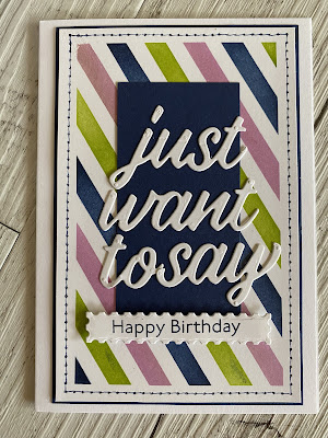
For this design, I chose a rainbow-striped background to bring an instant pop of Colour and positivity. The playful diagonal lines add a sense of motion, perfectly complementing the two hot air balloons floating among fluffy white clouds. I love how the pink and purple tones of the balloons balance the rainbow background without overpowering it.

The sentiment “Hang in There” feels especially fitting—it’s simple, heartfelt, and pairs so nicely with the uplifting imagery.

A few sparkling embellishments add just the right touch of shine, giving the card a breezy, happy finish.

 Card Details:

  • Background: Rainbow-striped patterned paper

  • Balloons: Stamped and die-cut in shades of pink, purple, and white

  • Clouds: Layered die cuts for dimension

  • Sentiment: Black ink on white cardstock with a bold border for emphasis

  • Finishing Touches: Clear sequins for a bit of sparkle

This card would be perfect to send to a friend who’s going through a tough time or just needs a little reminder that brighter days are ahead. 


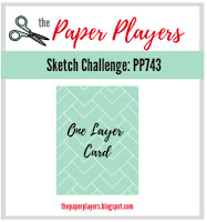
I made this card for the challenge over at The Paper Players using up some of my old stash.
My moto this year is “use what you have” to try and clean out my craft room. Here is the sketch.


Saturday, January 24, 2026

Art has no rules

 I made this little art page for my journal. I just love this collage image and she just sat beautifully in the snowy scene. There is certainly a lot going on here, especially the background. Texture paste, oxide inks, stencils, collage paper, stamping…..it’s definitely a mixed media piece. Love mixed media.


Art Has No Rules: A Whimsical Winter Angel Art Journal Page

There’s something so magical about winter—the calm blues, the sparkle of snowflakes, and the cozy feeling of being wrapped up in a soft jumper. Today, I’m sharing a mixed media art journal page that captures all of that winter wonder, paired with one of my favorite creative reminders: Art Has No Rules.

This page combines paint, texture, collage, and a sweet winter angel to create a layered, whimsical design that celebrates both the season and the freedom of artistic play.


✨ What You’ll Need

  • Art journal or mixed media paper

  • Acrylic paint or watercolour (teal, turquoise, white)

  • White gesso (optional)

  • Texture or modeling paste

  • Snowflake stencil

  • Palette knife or old credit card

  • Angel image (printed, drawn, or collage cut-out)

  • Adhesive or matte gel medium

  • White gel pen

  • Letter stickers or printed words: “ART HAS NO RULES”

  • Sentiment sticker: “I ♥ winter”

  • Self-adhesive pearls or gems


❄️ Step 1: Paint the Background

Start with a coat of gesso if your page needs a little prep. Then, paint a gradient from deep teal at the top to pale turquoise at the bottom, like a winter sky fading into snow. Don’t worry about perfection—soft, uneven blending adds to the charm.

Let it dry completely before moving on.


❄️ Step 2: Add Snowflake Texture

Place your stencil and spread texture paste through it using a palette knife. Randomly scatter snowflakes across the page, some large and some small. Let them overlap edges for a natural look.

Once the paste is dry, lightly brush white paint across the raised snowflakes so they catch the light—instant winter magic!


❄️ Step 3: Create Subtle Layers

For extra depth, stamp or handwrite a few faint lines of script in the background. A little scribble of blue ink or graphite adds that dreamy mixed-media texture we all love.


❄️ Step 4: Add Your Angel

Your angel can be printed, drawn, or collaged—whatever fits your style. This one wears a cozy blue jumper and fluffy slippers, with soft white wings to match the snowy theme.

Cut her out neatly and adhere her slightly off-center using matte gel medium. She should look like she’s standing in your snowy scene, blending naturally into the page.


❄️ Step 5: Build the Snowy Ground

Tear a strip of white paper and glue it along the bottom edge to create snowbanks.
Use texture paste or thick white paint along the torn edge for that fluffy, snowdrift feel.


❄️ Step 6: Add Your Words

Arrange your quote “ART HAS NO RULES” vertically along the left side.
At the bottom, tuck in your smaller sentiment—“I ♥ winter”—as a sweet finishing touch.


❄️ Step 7: Embellish the Magic

Stick on pearls or gems to mimic falling snow or twinkling ice crystals. Add highlights and tiny snow dots with your white gel pen.

You can even brush a little shimmer paint or glitter paste over a few snowflakes for sparkle!


❄️ Step 8: Final Details

Ground your angel by adding a soft shadow beneath her feet using diluted blue paint or a watercolor pencil.
If you’d like, seal the whole page with matte medium to protect your layers.


💙 Final Thoughts

This project is a gentle reminder that art truly has no rules. Let your imagination lead the way. If your snowflakes smear or your blues mix differently than you planned—embrace it. That’s where the beauty happens.

So grab your brushes, play with texture, and create your own winter angel story on the page. Because when you let go of rules, your creativity shines brightest.


Monday, January 19, 2026

More craft room

 Here are a few more pictures of my craft room.  This first picture is the wall behind my desk.


This picture is the wall in front of my desk.


New Beginnings


Here we go, another year of trying to keep my blog going. This year, I aim to be a lot more creative in my craft room. So for my first post for 2026…. I have spent a lot of time trying to figure out how I can make my craft room more accessible for my creative sessions. There is still a bit of tweaking to be done, but for now it’s working well.


I shall be posting more updates as soon as I finish the other wall. Stay tuned.

Thursday, June 26, 2025

Inner Strength


 Well, it really has been quite a long time since I have posted anything on this blog. I truely have forgotten what I am supposed to do. I made this card for the challenge over at The Paper Players. This card has been stamped and then coloured by Ohuhu Markers, which, I think are amazing to colour with. I asked AI what it thought about this card….oh how I love using this new technology.


In a world that often feels overwhelming, art has a unique power to uplift and inspire. The vibrant piece before us, adorned with cheerful sunflowers and an empowering message, serves as a beautiful reminder of our inner strength. 

The Symbolism of Sunflowers

Sunflowers are more than just a feast for the eyes; they symbolize positivity, warmth, and resilience. Their ability to turn towards the sun mirrors our own capacity to seek light and hope, even in challenging times. This artwork captures that essence perfectly, inviting viewers to embrace their strength and potential.

A Handmade Touch

The handmade quality of this piece adds a personal touch that resonates deeply. Each stroke and detail reflects the artist's dedication and passion, making it not just a visual delight but also a heartfelt creation. In a digital age, handmade art reminds us of the beauty of human touch and creativity.

The Power of Encouragement

The bold message, "YOU ARE STRONGER THAN YOU THINK," stands out against the backdrop of sunflowers, serving as a mantra for anyone who encounters it. It’s a gentle nudge to recognize our own capabilities and to push through self-doubt. This artwork can serve as a daily affirmation, a reminder that we possess the strength to overcome obstacles.
Infusing Positivity into Your Space

Incorporating art like this into your living or working space can transform the atmosphere. Whether displayed on a desk, hung on a wall, or gifted to a friend, it radiates positivity and encouragement. Surrounding ourselves with uplifting visuals can significantly impact our mindset and overall well-being.

Conclusion

Art is a powerful medium for expression and connection. This vibrant sunflower piece not only beautifies a space but also serves as a source of inspiration and encouragement. Let it remind you—and those around you—that strength lies within, waiting to be acknowledged and embraced. So, the next time you feel uncertain, take a moment to reflect on the message of this artwork and remember: you are stronger than you think.


Thursday, May 12, 2022

And just one more


Well just because I hadn’t packed away the supplies from making my last card, I decided to make another using the same colours from the Paper Players there is a lot more masking with this card and I used a stencil for the stripes. Love these colours together. They work so well.

Tuesday, May 10, 2022

Getting back into action

 I thought for my first post, I should check out some challenges that are available at the moment. Here is the one from the Paper Players, which as you can see is challenge 590. Wow. That is a huge amount of challenges. I hope to enter this challenge.


Here is my card I made for this challenge.


I have used the masking technique for this card, which I might add, is one of my favourite ways to make a custom background. I usually like to use up my old washi tape but for this card I used painters tape. I masked my card first, then randomly laced the painters tape to create shapes. Then onto the ink pads and sponges.

Where has the time gone?

 I feel like I have not used my blogger account for so long…I seriously have forgotten how it works. But, I am here again, trying to maintain my blog, add more content and have a bit of fun. I feel I have grown a little in the past few years, so this should be an interesting time. Now, to get into my craft room and start creating something to blog about. But, before I do anything, I really need to study how to use Blogger again. Phew, it just took me half an hour to work out how to get my header image right. One thing I have noticed though. There used to be so many sited that offered challenges, now there are not so many. I will have to investigate this further and start updating my blog.

Tuesday, January 29, 2019

Challenge #19 - RED


Over at Cute n Crafty this week, we have a special theme. Can you guess what that theme is.
If you guessed RED, then you were right.
I have used the stamp set from Treasure Box Designs called Digi Tots Two.
So very cute.

Tuesday, January 15, 2019

Cute N Crafty Challenge #18


This is my card I made for the Challenge #18 over at Cute N Crafty this week. The theme is Sports. I really hope you can come over and play along with us using a sporty card. If you want to grab this digital image, you can find it right here I love Sherry’s images. I wanted to keep this card fairly simple to really highlight the image. I especially love her eyes. Thanks for looking, and please call by the challenge blog and check out the amazing cards that the other Ladies have created.

Tuesday, January 1, 2019

Challenge #17 - Cute N Crafty


Well, I must confess, I am really bad at this blogging thing. I have made a ton of cards, but unfortunately, they never made it onto my blog. I have some exciting news though. I am now on the design team for Cute N Crafty If you click on this link, it will take you to the challenge blog where there is a new challenge with awesome cards from the design team.

Here is my take on the Challenge #17, which is anything goes, but I figure, it is still December so I will make at least one more Christmas card.

The image I have used is from Polkadoodles and is called Rudolph Onesies.
Click Here to go directly to the Digital stamp I used.


Saturday, October 21, 2017

Haunted Halloween

I know what you're thinking. Another Halloween card? Well, I'm sort of on a roll at the moment and these images are just too cute to leave un carded. (Not sure that is a word). I am learning so much about colouring since taking the course by Kit and Clowder. I would have never thought to colour the Zombie skin in green like this image, but it's pretty cute... for a Zombie, that is.


Seriously, how darn cute is this image from Tiddlyinks.


Here is the sketch that I have used for this card, although I did replace some circles with squares and maybe kind of rotated the sketch around a bit, but that's the beauty of sketches. If you want to play along with the challenge, here is the link. Freshly Made Sketches


Sunday, October 15, 2017

Spookaboo

I am really enjoying my colouring at the moment. I used this image from Tiddlyinks to create this card for their challenge at tiddlyinks challenge. This theme was Spookaboo! and although this little fellow isn't really all that scary, he was fun to colour.


I used some old paper from Stampin Up and I used my distress inks to create the night time theme. I love this little fellow. Well, actually, I love all the images at Tiddlyinks.


Friday, October 13, 2017

Painted Harvest

Today, I would like to share a card I made this morning. It is made from the newest stamp set in my collection called Painted Harvest, and may I say, it is quickly becoming one of my many favourites. I made this card for a class card and used the sketch from Freshly Made Sketches. I must confess, I am a sketch-aholic. They are so handy, and open to interpretation. So here is my card.


I love the way this card turned out. The patterned paper in the background.. well, it is not designer paper, I have hand stamped the background using the same stamp set. Here is the sketch I used.


Wednesday, May 24, 2017

Melbourne Zoo Trip


I'm pretty sure by now, ya'll know how much I love digital scrapbooking. I would never be able to complete a page like this if it wasn't for my beloved Apple.

Wednesday, May 17, 2017

Family moments

Well, I have been getting into a bit of digital scrapbooking lately. I am loving the ease of putting elements together and having my memories brought to life. This is the latest page I have finished of my children having a bit of fun together. Believe me this is pretty rare.


Love, love, love this page.

Wednesday, May 3, 2017

For the love of colouring


I received an email the other day with some awesome news from Tiddly Inks. They have released some amazing colouring pages. You all know how I love to colour. So the Challenge was to use flowers, or have flowers on your project. So, after racing to the online store, and purchasing these colouring books, I decided that this image was going to be just fine for what I needed. ALTHOUGH I now have heaps of different images to choose from. 

It is a bit tricky to see, but I have turned this colouring page into an easel card. I have kept embellishing down to a minimum as to not over power the main focus of the colouring. To colour this stamp I used a combination of Copic Markers and pencils, (which is something I  have been doing quite a lot lately), I love the way they gel together to get the required texture.


Monday, May 1, 2017

Little Miss Mitzi


If you hurry, you can still catch the challenge over at Freshly Made Sketches, and I do mean hurry. I made this card using the sketch below. I was sure that I had missed the deadline, but it is still open. Yeah! Here is another digital image from little miss muffet stamps and her name is Mitzi. I am so in love with these images. They are great to colour.