Tuesday, December 28, 2010
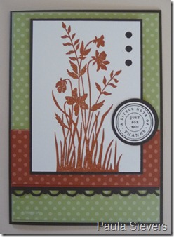
Mojo Monday Sketch
Monday, December 27, 2010
Onward to 2011
My New Years Resolution for 2011 is to spend the year getting myself and household 100% de cluttered and organised. Although I remember saying that last year, this year I am really serious. I thought I would post (on a different page) my journey. Starting with my craft room and my blog. Hopefully you will notice some changes.
HAPPY NEW YEAR!
My First Ever ATC
Thursday, December 23, 2010
Magical Birthday
Wednesday, December 22, 2010
Kenny K Downloads
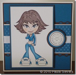
Here is another card for the girls that I have made (just in case my son is invited to another girls birthday). It’s always handy to have a stock pile ready to go. These downloads are from Kenny K. He has awesome digital images, especially for teenagers. I coloured the stamp in using photoshop 9 and all the cardstock and designer papers is from Stampin Up. I have taken a closer photo of the image so you can see it better.
Ahoy There–I’m back

Wow. I didn’t realise it had been so long since I had been in my craft room. Any wonder I am so grumpy. LOL. So here is the latest card I made yesterday. The image is from Bugaboo Stamps its another digital stamp. I must confess, I am addicted to digital stamps. All of the cardstock and patterned paper is from Stampin Up (naturally). The greeting is also from Stampin Up.
I again used Photoshop Elements to colour the image in and used the dodge and burn tool for the shading. I CASED this card from Paul Ford, who is on the designer team for Bugaboo Stamps, and I suggest you check out his work. He is another extremely talented artist. If you click on his name on the Bugaboo site, it will take you to his blog. Worth checking out.
Sunday, November 21, 2010
Colour Throwdown #119

The Color Throwdown

Thursday, November 18, 2010
Just Believe - Project Sheet - Free Download
Monday, November 15, 2010
Class Project November
Challenges, Challenges everywhere
The first Challenge I found was from The Colour Throwdown using the Stampin Up colours pictured left. Really awesome colours. This is Challenge number 118. So I think I am about 117 behind. OOps.
The Second Challenge comes from my beloved Mojo Monday sketch number 164. Where would I be without my mojo. Loved using this sketch. I think it will be one that I use quite often.
Last but not least. Here is my finished product. Yet another Christmas card out of the way for 2010. I used a 5'”x5” white card. All cardstock and Designer papers are from Stampin up. The image in the middle of the card is another one from Bugaboo stamps. Awesome.
Thursday, November 11, 2010
Tuesday, November 9, 2010
One for the Girls
My son was attending a girls 16th birthday party on the weekend and I, not only had to provide him with a ‘customary’ birthday card, but a GIRL card. You can probably tell from my blog that I am a mother to two boys. Not much room really for any girlie stuff in this household, it’s all planes, trains and automobiles. Here is the card I came up with, with a little help from Kenny K Digital Stamps.
So the report that came back, was that Nathan got a great big hug and was told that his mum is awesome. I was really happy with that, and so was Nathan.
Wednesday, October 27, 2010
More Christmas

This would have to be the best Christmas card I have made thus far. Again I have used the Dress Up Christmas bundle from stampin up. I brought this bundle (Delightful Decorations) because I hate cutting around stamps. Punches are heaps better than scissors. My opinion of course. Click on the link above and check out the other bundles available.
I used all the same products as the previous card, although this time I found a few tiny red buttons.
The card size is 5 x 5. The larger squares measure 2 1/8 x 2 1/8 and the whisper white measures 2 x 2.
More for Christmas
Here is another Christmas card ready to go. I purchased the new decorations bundle from stampin up which includes, 7 stamps, punch and selection of FREE ribbons. (Click on the link and check out the other specials).
I used the Ski slope designer paper, real red cardstock and old olive.
I even hung the ornaments from silver (not quite what you call this stuff), sort of like string maybe, and tied some baby bows to finish the card off.
Saturday, October 23, 2010
Another Christmas card
 Here is another Christmas card I whipped up this morning. Once again I have used the digital stamp from Bugaboo Stamps. I have also used Real Red, Whisper White, Old Olive and Chocolate Chip card stock.
 I have used Real Red and Old Olive Designer Papers from Stampin Up.
I am really impressed with this digital image. It is so cute. I am sure I will be posting more cards made using this digital stamp.
Happy Halloween

Okay, So we don’t have Halloween in Australia, but I couldn’t resist using this Digital Image from Dustin Pike to make a Halloween Easel Card. So to all my American followers who look at my blog. Happy Halloween
I used Stampin Up cardstock, Pumpkin Pie, Elegant Eggplant, Basic Black and Whisper White.
First Christmas cards
I found this brilliant digital image from Bugaboo Stamps and thought it would be perfect for my first Christmas card for 2010. I have soooo many to make, and sooooo little time to make them. Apart from the Digital Image from Bugaboo Stamps, I also used Stampin Up’s Designer paper called Birthday Bash, Pacific Point cardstock and Bashful Blue cardstock. I actually liked the way this one turned out.
Wednesday, October 20, 2010
Still Colouring

I opened up my digital stamp image from my computer. This is what the image looks like when you open it in Photoshop Elements. (My favorite program of all time). Use this even for Digital layouts and templates for scrapbooking.
Before I colour an image, I make sure that I have saved it under another name. EG ‘girl’ was the original file name, so I save another one called ‘girl coloured’. That way you can colour in as many images as you like.
Most importantly, have fun. This process becomes very addictive when you get the hang of it.
Sunday, October 17, 2010
Mojo 160

Here is my submission for Mojo Monday sketch number 160. I made a few tiny alterations to the sketch, but all in all it is pretty much the same. I have used another digital stamp from Dustin Pike and again coloured with RGB’s to match the Stampin Up cardstock.
Concord Crush, Pear Pizzazz and Whisper White.
Clowning around

Hope you like it. :)
Wednesday, October 13, 2010
New Mojo Sketch

Here is the latest Mojo Sketch for this week. Sorry I have been a little bit slack getting the pictures on my blog.
I really like this layout, and I think I will be using it quite a lot. I am also going to try and create a 6 X 6 album page using this sketch. Gotta love versatility.
I will post my card when it is finished.
Tuesday, October 5, 2010
I’m Back

Boy, it has been so long since I have Blogged anything. I think I am having withdrawals. This card sketch is (naturally) an older one of Mojo Mondays’. I basically copied the colour scheme of the one that Mary Fish has on her site for the example sketch.
www.stampinpretty.com (I hope that is the right one) She has amazing work on her blog. So very talented. And her scrap room! I am so very jealous…...lol.
Real Red designer paper – Bright Collection Designer Pack Daffodil Delight designer paper – Bright Collection Designer Pack Brights buttons – Chocolate Chip cardstock and ribbon Clear button – Penny Black Stamp (my favourite)
Saturday, September 18, 2010
Just Believe 156
Thursday, September 16, 2010
Homework finished

So, I thought it may be easier to show you what the finished product looks like, before you start scratching your head in confusion, as I did when I re read my previous post. You can click on the picture to enlarge. I have finished the left hand side of the sheet, and whenever I make a card using the sketch, I will include the colour on the right hand side. A bit of a reference sheet really.
Hope it makes a little bit more sense now. Have a play, you may find it useful!
There is a mouse in the house

For this weeks class, I made some handouts with a mojo sketch and an example of a card I had previously made printed on it.
My class then had to reproduce the card, using the sketch supplied.
For homework, aah, I asked them to make two other cards using the same sketch. I will place a download link for the handout I made, in case you want to give it a go as well. When you download the sheet, you will find it blank. The first large square is to cut out a sketch and adhere it for a sketch reference. (I use mojo) and the second large square is to either place an example of a finished card for reference, or you could include another sketch if you want to. The smaller squares on the bottom of the sheet is for a 3/4” circle punch. I punched out the colours I used from the scrap card stock and stuck them on the sheet also. So now my class has: a sketch of the card, an example of the card and a colour combination which was used to make the final card. When the first sheet is finished, there are three different colour combinations that they can use, (whenever they make a card). Hope this all makes some sense. The download link is Click Here Have fun. Oops almost forgot, when you print the document above, either print as is for a normal size binder, or as I do, my desk is too messy for a large folder, so I print and change the settings to multiple pages, cut them in half and insert them into my little folder. Just another option. Oh yeah, and if you do download the document and try it out, please let me know how you went. Thanks
Sunday, September 12, 2010
Mojo Sketch week 75

Here is my submission for the February 2009 Week 75 Mojo Sketch Challenge. I think I missed the deadline. Oh well, there really is no time limit. Just have fun. The photos here show the sketch on the left, the front of my card in the middle, and the inside of my card on the right. I really like this sketch and I think I will be using it a lot more. I also used one of my Penny Black stamps. Naturally, all paper is from Stampin Up. Thanks for looking.
Saturday, September 11, 2010
My Mojo 155

 Here is my Mojo Sketch 155 card. I have again made a card using the new stamp set called Baby Bundle. I really like this stamp set. I have also used some of the Hostess Paper Pack designer papers and some of the papers out of the Simply Scrappin kit for girls. It almost looks like the sketch on the left.....
Sunday, September 5, 2010
Backpack School Album part 2
Backpack School Album

Saturday, September 4, 2010
T Slider Card

http://www.splitcoaststampers.com/resources/tutorials/Tslidecard/
It's a lot of fun to make, and can be adapted in several ways. I used a digital stamp image from Dustin Pyke. I really like his images, really great for using the blender pen and ink pads. I forgot to mention that I made one small alteration. I put another tab punch on the T Bar slider so I can pull on this, instead of relying solely on the one that closes the flap. I really hope that this makes sense. I think it will when you make one.


![P1010785_thumb[1] P1010785_thumb[1]](https://blogger.googleusercontent.com/img/b/R29vZ2xl/AVvXsEiBLTmhRBRWem4Y71ALGxyMfpwlHJeI6H9qdCeH76QC0WJfwF_yy-dwRjKtr7LI8vrKMyeQ7zdLYuVzg_ohuCOqhdMJOHjAcYE3bjnHqoYbCJdsmAYh6V20Fky8QoCH6lcchrFhHgAscY8/?imgmax=800)
![P1010784_thumb[9] P1010784_thumb[9]](https://blogger.googleusercontent.com/img/b/R29vZ2xl/AVvXsEhTKO2eisg8hFVd93C8Ma6jkKW7pGnCgu4hDWhUsCHEsf_-FK0qQP1is402Ykg2Ymp8dSKpSNa8oDa3noJnRLhyuRBrivYDveva1USfZkQoGDdSFmalsmvC2JI31byqpS4oJtuem1_d_w4/?imgmax=800)
![P1010795_thumb[8] P1010795_thumb[8]](https://blogger.googleusercontent.com/img/b/R29vZ2xl/AVvXsEjRD13i5hbg4hUcgvEZzSnXf39PO7mOFX6VwzEdsxsrE9PKwRgtCgNX8KvjwnnmTYbg1fqTuh5aUKn7_pDkcYUzf05pQvfJXrmfnubot2Qkm8KcqctYaUTCKgR2TLyVtA1FJa0S78Kk9p4/?imgmax=800)


